Carlino’s Market Signature Collection Tomato Sauce Rebrand!
Rebrand Objectives
Cleaner and Brighter Look
Stand out against competition on the shelf
Emphasize family-owned aspects and personality
Still recognizeable as Carlino’s brand to current audience while attracting a new audience unfamiliar with our brand.

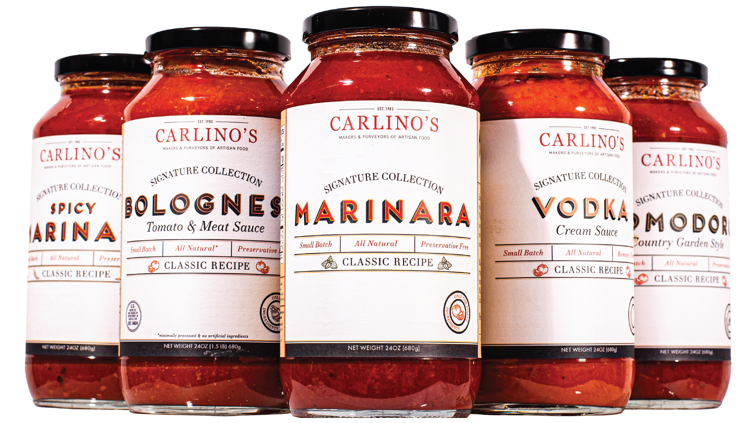
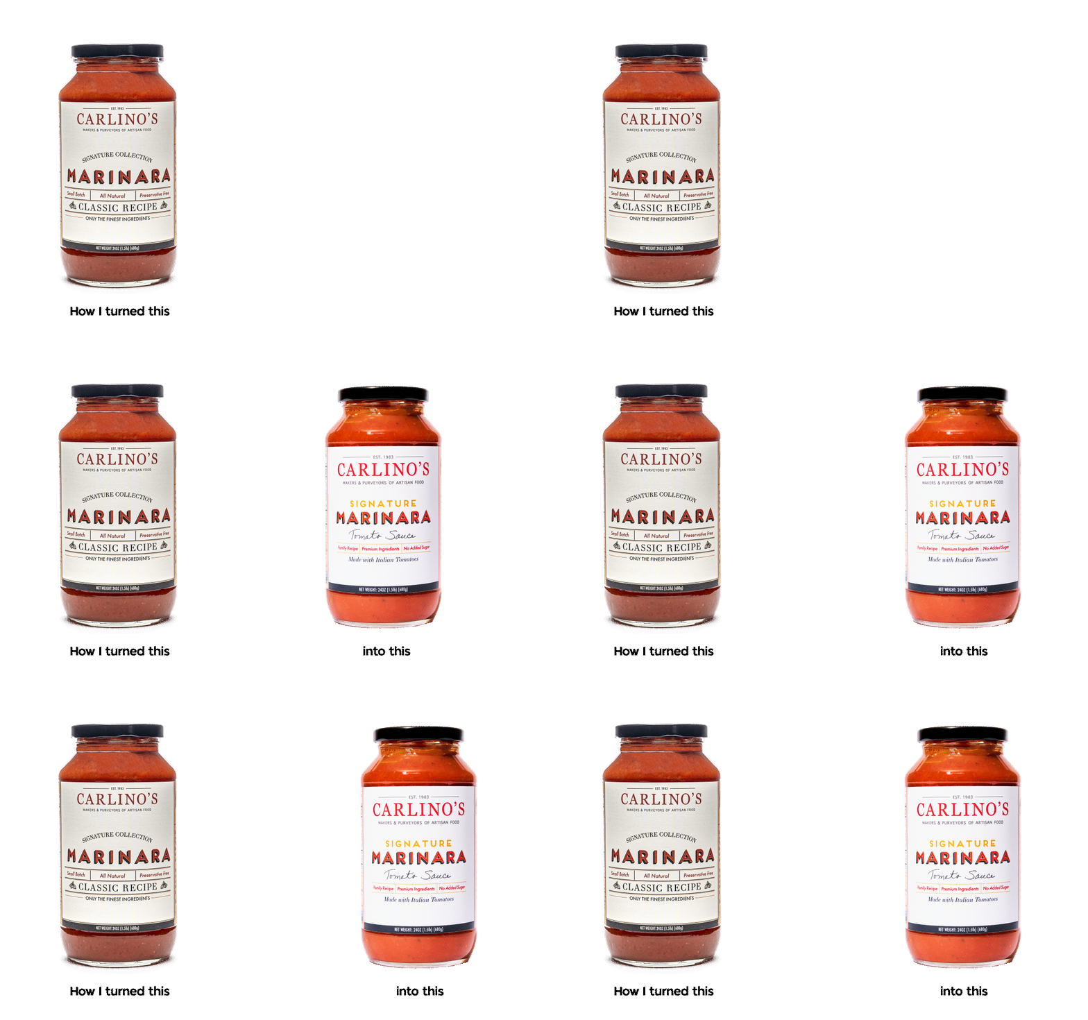
Before


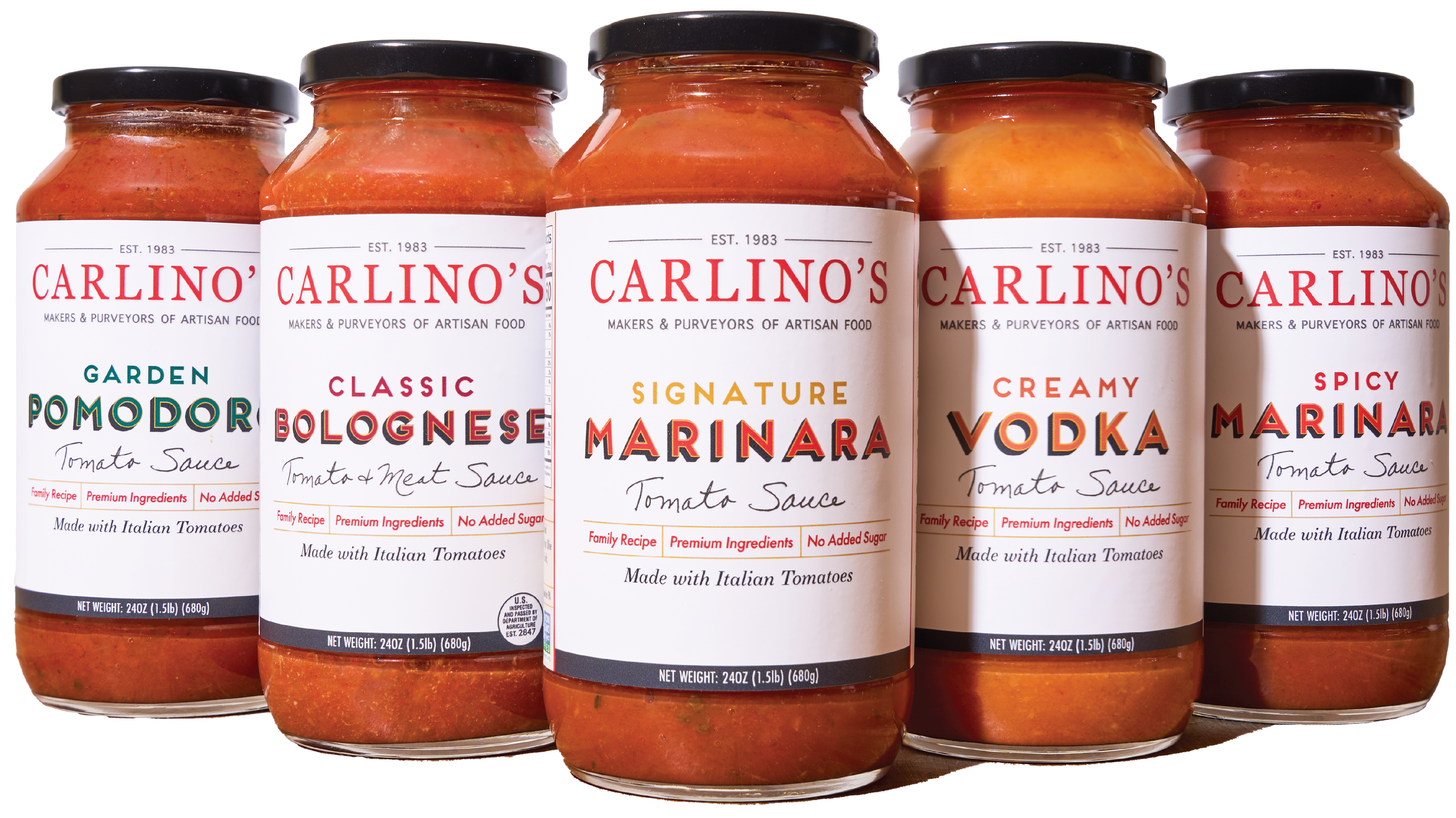
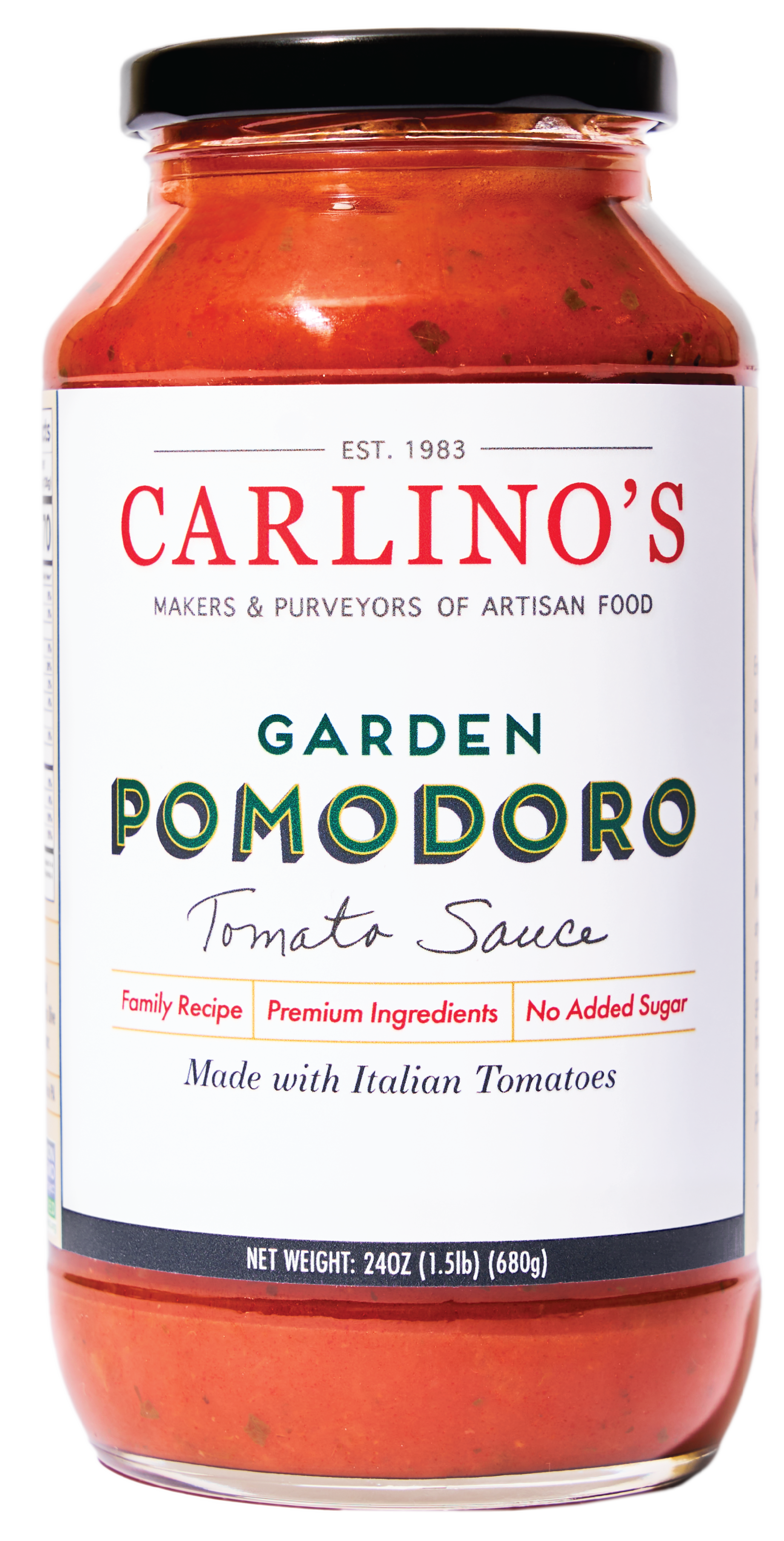
After


How I achieved these goals
Keep the hierarchy and color palette similar so the current customer can still recognize our packaging.
Bring more attention to the logo for new and existing customers to see us on the shelves.
-
There were lots of little issues with the previosu label and one that was glaringly clear on the shelf was that the titles did not align when all the variants were placed next to eachother. The words Marinara, Vodka, Pomodoro, and Bolognese all bounced around as they were centered to their individual label but were not treated as a part of a collection. Part of the fix for this was adding a subtitle above each main title on all jars. This helped keep the line cohesive and easily understandable for new customers to tell which sauce they want.
-
What words do people really look for when shopping for tomato sauce?
I found that words like “natural” and “preservative free” are becoming obsolete as people see them as buzzwords for brand marketing and not the truth of the product.
Even though our product is made with natural ingredients uninhabited by preservatives, these words weren’t helping us gain new customers. Through research and testing I found that existing customers loved that our Sauce has no added sugar, is made with high quality Imported Italian ingredients, and that the recipe was created by a real family that cared about their food and not a corporate machine.
-
What’s aging the current look of this label?
Part of the Carlino’s brand is the timelessness of quality food. The previous packaging was aging the product and making the recipe and taste seem outdated and old. We want to ensure our customers that all ingredients are fresh, tasting as if they were plucked straight from the garden! I rremoved the aged textured background that dulled the entire label in replace for an off white brand consisitent cream that softened the pure white of the label material.
I spent a long time perfecting the colors of the title copy as the previous label had darkened text that had not been formatted for printing.
I also found that the overuse of the serif font was adding to the aged look of this label. I opted for our main brand fonts and utilized the serif font sparingly. The small illustrations also had to go as the aesthetic of cross hatched linework has a historical association with traditional art forms like etching and engraving.
Add in handwriting from Company Owner Mrs. Carlino to reinforce the Family Owned and Family Recipe aspect of the brand.


